Monday 12 December 2011
Thursday 8 December 2011
Commentary - Filming plan
We have filmed our commentary in the same green room we filmed the video in, to show our location and also to make it clear that we are not performing and want the listeners attention.
We filmed the sequence side on to the speaker, we did this to create an original look, like our video, and to help read notes off the script that was being held just off the shot.
We plan to position clips from the video itself in the empty space in the shot, in front of the side on speaker.
We filmed the sequence side on to the speaker, we did this to create an original look, like our video, and to help read notes off the script that was being held just off the shot.
We plan to position clips from the video itself in the empty space in the shot, in front of the side on speaker.


Wednesday 7 December 2011
Costume Inspiration
We were inspired by Lady Gaga's outfits, particularly the one on the cover of her album 'The Fame' and the various shoots of that outfit throughout the digipak. We tried to incorporate as much of this as possible, for example, the use of he hood, dark colours and various necklaces.


Commentary Script
We created our script for our commentary by combining different parts of each of our individual evaluations. We selected the best and most informative paragraphs from each others evaluations and linked them together to make sure the commentary flowed and made sense to the listener.
We then condensed the script into brief notes, held them up for the person to read and the whilst the person was being filmed they read out load what they saw on the script.
Deadlines - December
Commentary on blog - Wed 14th December
Improving indevidual evaluations - Mon 12th December
All blog work finished - Thurs 15th December
Improving indevidual evaluations - Mon 12th December
All blog work finished - Thurs 15th December
Sunday 4 December 2011
Connor Banks - Final Evaluation
In what ways does your media product use, develop or challenge forms and conventions of real media products?
When researching music videos we gained inspiration from Madonna's 'Hung Up' and the continuous use of a boom box throughout every location and clip. The same boom box would be seen in different locations and with different people and we wanted to highlight this in our product.
We also looked at Nickleback's 'Rockstar' music video. From this we saw different social groups and types of character lip syncing the song. There was also a recurring character who was cut to every so often in the video. We decided would be the artist for our video as the audience can take refuge and confidence in the recurring character every time they appear on screen. We found this quite effective and took on board some of the aspects that were seen in 'Hung Up' in relation to 'Rockstar'. We wanted to demonstrate this in our video as we could see that including these different social groups involved the audience more and gave us a change to successfully convey our target audience through the video.
Our video itself develops the revival of the 80's pop genre and adds a new quirk to the fun and colourful electric pop genre. We wanted to exploit the need to sell the artist as much as possible through colourful backgrounds and visual/lyrics with the use of the phone hand signal. We wanted to convey these characteristics appropriately and approximately in order to establish a strong link between artist and audience.
We looked at digipaks and magazine adverts for David Bowie and Madonna, and decided that we wanted to mimic the eccentric and voyeristic style of marketing they had produced. As well as showcasing the 80's genre again by linking generations, we also manage to create a new, vibrant and colourful piece that highlights the artists persona and diva image, much like the talents of Madonna and David Bowie.
How effective is the combination of your main products and ancillary texts?
All three parts of our promo package work together effectively mostly through the originality and concept for the package. Our concept itself was to attract a variety of audiences and social groups making our target audience as vast as possible. We wanted to achieve a new and original look in our package, much like the styles in the current, popular music industry. We achieved originality through the artists eccentric clothing and quirky performance style, creating a new, vibrant and fun image to attract the young, trend-driven target audience.
What have you learnt from your audience feedback?
Upon receiving feedback for our rough cut version of the video, we were mostly pleased with the results. The majority of feedback being positive with a few minor details to improve on. It was said that the variation, timing and pulsing of shots and cuts made the video very engaging and desirable to watch. The video was said to have a 'good feel' to it and that this element never wore off or became boring. Some negative feedback included tweaking the coloured backgrounds to a complete block colour and making sure that all the clips were in sync with the music. Feedback from staff and teachers was mostly positive for the same reasons. However they suggested exploiting more footage of the artist as the performance from the artist was so strong and captivating for the audience.
Feedback on our final piece also highlighted a few issues. The transitions between shots could've been much more eccentric and fun to fit in with the atmosphere of the video. It was also said that it would make the video more interesting. Positive feedback included the main singer singing to the camera constantly. It was noted also that the female character syncing the dialogue in the middle of the song made the video much more amusing.
Feedback on our digipak and magazine advert suggested that we should exploit more of the artist, seeing as though we did most of that in the video. A simple visual metaphor for a product wasn't as engaging and didn't showcase the continuity of the promo package as a whole. We decided to place large scale images of the artist on both of the products to link the video with them. The artist can also be seen performing the phone 'Call Me Up' hand signal and holding the rubber duck, both of which are seen in the video.
How did you used new media technologies in the construction and research, planning and evaluation stages?
We used a varied amount of technology in creating the video, some being basic and some being quite complex and alien to us which proved a challenge at some points in the construction of the product. We were able to work with Final Cut which is a program we in the group are all familiar with. We were introduced into new techniques such as fading the video sharply to make it pulse and also animating the clip so it shifts across the screen. I these techniques proved effective with the timing and editing of the video.
We were also introduced to the green screen techniques we had to learn, such as finding the right chromer key to match the colour of the green screen wall. It was a very tedious process making sure that there were no freckles of green on the shot however the effort and time payed off when we completed the video to good quality. Before filming we practiced this using various location images as our background.
Our biggest challenge was working with Photoshop to create our digipak. The ideas we had planned for the digipak could not be completed due to our general lack of knowledge on how to use Photoshop. It proved more time consuming and we had to rethink the image we wanted the digipak to posses.
We used a video camera and still image camera to capture footage to be edited or modified for both our music video and digipak. This proved extremely useful when we felt we didn't have enough footage as we could very quickly film and upload in a fast and productive amount of time. We also found this useful when we had trouble with Photoshop as we were able to go to the studio and take back-up pictures with the still image camera.
We also used Blogger to keep track of progress and return to previous moments of inspiration if we needed to, which proved very useful when we had to rethink ideas for our digipak.
Thursday 1 December 2011
Reflection of make up design


These images show the process of our make up designing, we took an image from google images of the main character of clockwork orange and copied the makeup, we did this because we thought it gave our character a unique style, also including intertextuality.

Script
QUESTION ONE///////CONNOR
We spent time researching into music videos such as Nickel Back - 'Rockstar' and Ed Sheeran 'You Need Me But I Don't Need You'. Both these videos expressed ideas that we hoped to include in our own video ideas. Such as lip syncing, dancing and visuals / lyrics. As our artist and song belonged to the electric pop genre, we mainly looked at artists such as MGMT, and Chromeo themselves. We realised we would need an upbeat, fast paced video to keep in the tone of the song. However, one thing we did slightly differently to the conventions of an electric pop genre song was the use of different coloured backgrounds. Most of the videos we analyzed were set in a dark club, where as we thought we would add to the fast paced, up beat song by using these bright colours. We also based the make-up of our main character on the film "clockwork orange" and the idea of using multiple numbers of characters in our video, after receiving feedback from Mark, we decided this idea pulled the focus away from the artist, reducing the 'Need To Sell Artist' In Goodwin's Theory.
Also the section with Jess, as she is always looking directly at the audience, which makes the audiences feel more involved and more fun and interesting to watch.
Overall, we reveived positive comments, which made us extremely happy with our finished product.
He use of blogger helped us keep in track with our ideas and plans, and we were able to show the examiners what we intended our products to look like due to the examples and blogs we had posted.
We spent time researching into music videos such as Nickel Back - 'Rockstar' and Ed Sheeran 'You Need Me But I Don't Need You'. Both these videos expressed ideas that we hoped to include in our own video ideas. Such as lip syncing, dancing and visuals / lyrics. As our artist and song belonged to the electric pop genre, we mainly looked at artists such as MGMT, and Chromeo themselves. We realised we would need an upbeat, fast paced video to keep in the tone of the song. However, one thing we did slightly differently to the conventions of an electric pop genre song was the use of different coloured backgrounds. Most of the videos we analyzed were set in a dark club, where as we thought we would add to the fast paced, up beat song by using these bright colours. We also based the make-up of our main character on the film "clockwork orange" and the idea of using multiple numbers of characters in our video, after receiving feedback from Mark, we decided this idea pulled the focus away from the artist, reducing the 'Need To Sell Artist' In Goodwin's Theory.
Our video uses the typical characteristics to the electric / pop genre of the song such as bright colours, lots of energy and dancing and we also gained influence through 'Lady Gaga's' unique fashion style. We also used visuals / lyrics in our media product such as the words "call me up" are met with the hand gesture in the shape of a phone. Our music video also uses quick fast changes in time with the music which relates to the visuals in the music. On regard to the "Need To Sell Artist" we used a lot of the 'artist' in the video, he is seen often lip syncing the words reflecting this approach. We expressed intertextuality through the use of fashion and props such as an MTV logo t-shirt, iPhone, designer footwear and also relating the target audience too the video. The voyeurism is concluded by the main majority of the shorts being done looking into the camera as if it was a mirror.
MADONNA was also an influence in her video 'Hung up'. We were inspired by the continuity of the boom box and decided to reference and replicate this in our own video.
MADONNA was also an influence in her video 'Hung up'. We were inspired by the continuity of the boom box and decided to reference and replicate this in our own video.
QUESTION TWO/////////JESS
All three of our pieces carry the same theme of vibrant colouring and the use of abstract props e.g. the rubber duck, and hand gestures.
The concept of our media package is full of energy, fun, it is made to be very modern, especially seen through the use of modern props i.e. iPhone and fashion. It could also be argued as unique, it expresses individual approaches auch as the make up and the use sunglasses as props.
It's main goal was to give a positive image, i believe all three do this through the bright colours, facial expressions captured, e.g. The artists face in the video and on the digipak materials are positive and happy. This also creates a successful positive image of the artist.
All of the materials attract the target audience through the target audience's age group featuring in the video. Also similar fashion ideas and hobbies, for example dancing, are seen in the video and on the digipak. The genre itself is commonly aimed at teenagers (electric-pop) which is an instant attraction of the target audience. The link between the 'geeky' styled glasses in the video and the front cover wording on the digipak, also including the track names all being made to relate to the options and their letter charts is a humorous theme that could be enjoyed by the target audience, overall i believe it will successfully attract the target audience.
All three parts of our promo package work together effectively mostly through originality and concept for the package. Our concept itself was to attract a variety of audiences and social groups making our target audience as vast as possible. We wanted to achieve originality in our package much like the styles in the current popular music industry. we achieved origionality thorugh the artists eccentric clothing and quirky performance style creating a new, vibrant and fun image to attract the young, trend-driven target audience.
Connor's perfprmance in our music video being as strong as it was made it essential that we had his face on everything, so that the audience can recognise him from our music video then they open a magazine and see him or if they are in a music store and recognice our digipak from Connors performance in our music video.
QUESTION THREE////////AMY
The Feedback on our rough cut piece included comments such as the lip syncing being slightly out, positive feedback included that we achieved a successful music video that reflected the genre well. We also received feedback from the members of staff saying that we needed to include more editing techniques to make it more energetic and jumpy. We asked for advice on how to include this in our final cut.
Some peers also commented on the single coloured background saying that they liked it (this was before we added the green screen effects) we had to consider this before are final video as to whether it would work better with just the green background.
Our final cut feedback included, the good concept on reflecting Goodwins theories successfully for example the genre characteristics of bright colours and fun props. They picked up on the way the main singer is seen singing into the camera at all times, they also said the use of the female character makes it fun and humorous.
We received some improvments we could have made when it came to the transitions. Some people said we could have used more variation when it came to the transitions, but for now this is something we will think about in the future.Overall, we reveived positive comments, which made us extremely happy with our finished product.
Negative feedback was given on the transitions between shots, it was said that more could be used to make it more interesting.
QUESTION FOUR////////FERGUS
We used final cut to edit our music video together, we enjoyed this because we are now familiar with the basics and could further our understanding with new techniques such as making the clip pulse and also make the character slide across the screen.
We used Photoshop to create our digipak this proved most difficult because we had limited knowledge of the programme. We couldn't complete the initial ideas we had and this became very time consuming and complicated.
We used blogger to keep track of everything we were doing and we also used it to refer back to recurring themes and ideas, this became very helpful.
Overall, i think the majority of the new software helped us in the construction of our products and we also learnt a lot of new skills during the process.The HD video camera was really good to use, we were all able to look back on our footage instantly making discussion easy and we were able to view and change ideas if neccersary.
Again this was achieved on the still image camera, we had the ability to try numerous shots and view them instantly.
Fergus Cussell - Evaluation
In what ways does your media product use, develop or challenge forms + conventions of real media products?
I feel our media product uses existing conventions including the fast pace in our music video and also the bright colours used throughout our video, digipak and magazine advert. we focused heavily on the need to sell artist, Connor's performance in our music video being as strong as it was made it essential that we had his face on everything, so that the audience can recognize him from our music video then they open a magazine and see him or if they are in a music store and recognize our digipak from Connors performance in our music video.
How effective is the combination of your main product + ancillary texts ?
I think that the combination of both of them is very effective. The bright colours of the music video were also replicated when writing the artists name on the digipak, each letter of 'Chromeo' would be a different colour to the last. I think having Connor on our ancillary texts was essential because he played a big role in the music video. I feel that they work well together.
What have you learnt from your audience feedback?
The main positives that people mention on our music video is the fast cuts and the good use of lip syncing. They also say the cuts on the beat in parts work really well From the feedback I can see that the performances by Connor and Jess really helped the video connect with the audience especially Jess' performance because she talked to the audience and asked questions making the audience feel more involved and created a more enjoyable feel to the overall video.
How did you use new media techniques in the construction + research + planning + evaluation stages?
We used Final Cut Express to edit our music video, I enjoyed using this program as I have used it on previous tasks. When editing I learnt how to Chroma Key out the green screen. To create our digipak and magazine advert we used Photoshop, this became very tedious because it has complicated ways of doing things.
Evaluation - Amy Douglas
Q: In what wyas doe syour media product use, develop or challenge forms and conventions of real media products?
A: When producing our video, we analused a number of different professional products that were similar genre to our artist, Chromeo. As our artist and song belonged to the electric pop genre, we mainly lookied at artists such as MGMT, and Chromeo themselves. We realised we would need an upbeat, fast paced video to keep in the tone of the song. However, one thing we done slightly differently to the conventions of an electric pop genred song was the use of different coloured backgrounds. Most of the videos we analysed were set in a dar club, where as we thought we would add to the fast paced, up beat son by using these bright colours.
We also researched into the theme of "A Clockwork Orange". We mainly focuses on the make up design. We thought the make up would add influence into our video. We were also influenced by Ed Sheerans video "You Need Me". We liked the idea of just habing one dancer to include in the video.
Q: How effective in the combination of your main product and acillary texts?
A: When trying to come up with a suitable digipak and magazine advert, we weren't sure whether to carry on the theme of bright colours or go slightly different. We were trying to communicate to the younger generation, by keeping in the style and fashion at this time, and wanted to create an image of fun, new and fresh for our artist. Using a fresh white/grey background and brightly coloured fonts, we managed to create a professional and fun magazine advert and digipak. The link between the two and the music video is the theme of the "A Clockwork Orange" make up, and the use of bright colours. I think our products work well to attract our target ausing by the use of colours and props. For example, we used some trendy glasses that also appear in Kanye West's video, in our digipal image and music video to relate to the younger generation.
Q: What have you learnt fomr your audiences feedback?
A: When we received our feedback from the group, we learnt that we were ont he right tracks when it came to the production of our video. We had many positive comments on the use of fast paced editing and brightly coloured backgrounds as they seems to fit in with the genre and the beat of the song.
When talking about Notions of Looking, we alsoreceived a number of positive comments, such as how the maing singer, Connor, lips syncs to the camera, looking directly at the audience as it sold the artist well. Also the section with Jess, as she is always looking directly at the audience, which makes the audiences feel more involved and more fun and interesting to watch.
We received some improvments we could have made when it came to the transitions. Some people said we could habe used more variation when it came to the transitions, but for now this is something we will think about in the future.
Overall, we reveived positive comments, which made up extremely happy with our finished product.
Q: How did you used new media technologies in the construction and research, planning and evaluation stages?
A: The use of Final Cut really helped in the construction of our video. It enabled us to do simple but effective techniques in our video, but we alsoi learnt a lot of new techniques a long the way. For example, we created, whats like a thumping motion, for some of our clips to keep in touch with the fast paced song. We also learnt how to show the same clip in different split screens which created a good vibe in our video, and made it more interesting.
Howeber, when creating our digipak and magazing advert, we struggled to use photoshop and we weren't able to go through with our original idea as we did not know how to work it.
The use of blogger helped us keep in track with our ideas and plans, and we were able to show the examiners what we intended our products to look like due to the examples and blogs we had posted.
Overall, i think the majority of the new software helped us in the construction of our products and we also learnt a lot of new skills during the process.
Wednesday 30 November 2011
Media Evaluation - Jessica Howard
Question One
We spent time researching into music videos such as Nickel Back - 'Rockstar' and Ed Sheeran 'You Need Me But I Don't Need You'. Both these videos expressed ideas that we hoped to include in our own video ideas. Such as lip syncing, dancing and visuals / lyrics. We also based the make-up of our main character on the film "clockwork orange" and the idea of using multiple numbers of characters in our video, after receiving feedback from Mark, we decided this idea pulled the focus away from the Artist, reducing the 'Need To Sell Artist' In Goodwin's Theory.
Our video uses the typical characteristics to the electric / pop genre of the song such as bright colours, lots of energy and dancing and we also gained influence through 'Lady Gaga's' unique fashion style. We also used visuals / lyrics in our media product such as the words "call me up" are met with the hand gesture in the shape of a phone. Our music video also uses quick fast changes in time with the music which relates to the visuals in the music. On regard to the "Need To Sell Artist" we used a lot of the 'artist' in the video, he is seen often lip syncing the words reflecting this approach. We expressed intertextuality through the use of fashion and props such as an MTV logo t-shirt, iPhone, designer footwear and also relating the target audience to the video. The voyeurism is concluded by the main majority of the shorts being done looking into the camera as if it was a mirror.
Question Two
All three of our pieces carry the same theme of vibrant colouring and the use of abstract props e.g. the rubber duck, and hand gestures.
The concept of our media package is full of energy, fun, it is made to be very modern, especially seen through the use of modern props i.e. iPhone and fashion. It could also be argued as unique, it expresses individual approaches auch as the make up and sunglasses as props.
It's main goal was to give a positive image, i believe all three do this through the bright colours, facial expressions captured, e.g. The artists face in the video and on the digipak materials are positive and happy. This also creates a successful positive image of the artist.
All of the materials attract the target audience through the target audience's age group featuring in the video. Also similar fashion ideas and hobbies, for example dancing, are seen in the video and on the digipak. The genre itself is commonly aimed at teenagers (electric-pop) which is an instant attraction of the target audience. The link between the 'geeky' styled glasses in the video and the front cover wording on the digipak, also including the track names all being made to relate to the options and their letter charts is a humorous theme that could be enjoyed by the target audience, overall i believe it will successfully attract the target audience.
Question Three
The Feedback on our rough cut piece included comments such as the lip syncing being slightly out, positive feedback included that we achieved a successful music video that reflected the genre well. We also received feedback from the members of staff saying that we needed to include more editing techniques to make it more energetic and jumpy. We asked for advice on how to include this in our final cut.
Some peers also commented on the single coloured background saying that they liked it (this was before we added the green screen effects) we had to consider this before are final video as to whether it would work better with just the green background.
Our final cut feedback included, the good concept on reflecting Goodwins theories successfully for example the genre characteristics of bright colours and fun props. They picked up on the way the main singer is seen singing into the camera at all times, they also said the use of the female character makes it fun and humorous.
Negative feedback was given on the transitions between shots, it was said that more could be used to make it more interesting.
Question Four
We used final cut to edit our music video together, we enjoyed this because we are now familiar with the basics and could further our understanding with new techniques such as making the clip pulse and also make the character slide across the screen.
We used Photoshop to create our digipak this proved most difficult because we had limited knowledge of the programme. We couldn't complete the initial ideas we had and this became very time consuming and complicated.
We used blogger to keep track of everything we were doing and we also used it to refer back to recurring themes and ideas, this became very helpful.
The HD video camera was really good to use, we were all able to look back on our footage instantly making discussion easy and we were able to view and change ideas if neccersary.
Again this was achieved on the still image camera, we could try numerous shots and view them instantly.
Monday 28 November 2011


Directors Commentary - Amy Douglas
A Director's Commentary is descriptive feedback from the director of a performance or a produced product. It's an opportunity to look back and suggest possible improvments that the producers could have made, and also say what's good about the product or performane; if any. Derector's Commentary is useful when producers are keen to hold future productions.
Here is an example of one way i think we could present our commentary:
http://www.bbc.co.uk/blogs/beinghuman/2009/07/directors_commentary_6_bernies.html
I like the way there is a voice over the clip, enabling the viewer to see and realised exactly what the director is talking about at the time.
Here is an example of one way i think we could present our commentary:
http://www.bbc.co.uk/blogs/beinghuman/2009/07/directors_commentary_6_bernies.html
I like the way there is a voice over the clip, enabling the viewer to see and realised exactly what the director is talking about at the time.
Wednesday 23 November 2011
Magazine/Digipak examples
Here are some examples of what we are trying to follow when creating our digipak:
 |
| Chromeo |
 |
| U2 |
 |
| MGMT |
Digipak production
Although we had already taken pictures for our digipak, which consisted of Connor's lips in vibrant red lipstick, we thought we better take more pictures of Connor in front of the green screen. We done this to add variation to our digipak, and to sell the artist better. We also thought we should just for choice.
Once we got the pictures back, we decided on one particular picture as it stood out most to all of us. We first used the picture and wrote 'CHROMEO' above in one solid colour which happened to be orange as the colour orange played a big part in one of the props. However, after seeing this and being very pleased with it, we decided to try changing each letter of 'CHROMEO' different colours that also are included in the picture. We preferred this to the first idea.
Digipak Images


A clockwork orange theme
Throughout our production of the video, we have tried to keep this theme of 'A Clockwork Orange' in our project. We liked how the make up was laid out on the character in the film, so decided to do something similar with Conner's make up. This was emphasizing the make up on just one of his eyes.
We hope to use this style make up not only in the video, but on the digipak as-well.
We hope to use this style make up not only in the video, but on the digipak as-well.
 |
| A Clockwork Orange |
Open Evening Editing
We decided to stay and work during open evening as we thought the extra time would benefit us when trying to finish our video. We mainly focused on getting the background colours in, using chroma key. However, this seemed to take up more time than we expected so we had some help from other media teachers. Once we had filled in all of the background colours, we asked for other techniques to make our video feel alive and bubbly. This is where we learnt the thumping technique. Tanya explained how this thumping technique would work well with our video as it is fast paced and upbeat. This technique came in handy, and has been used in our final cut.
Although we didn't finish our video during this time, we told that we had one extra day to finish due to a misunderstanding. This meant we had all the little touch ups to do next lesson.

Although we didn't finish our video during this time, we told that we had one extra day to finish due to a misunderstanding. This meant we had all the little touch ups to do next lesson.

Monday 21 November 2011
Final Cut deadline lesson
Our final cut deadline day turned out to be stressful as we realised we had lots of little things to edit. after getting lots of feedback from the staff in the media department, we decided to scrap a few shots as they seemed 'unprofessional'. We also got told to make the shot of the feet more interesting by putting two or more images over the top of each other to create a more interesting and exciting shot. Our feet shot now includes feet coming from the top, side and bottom. This has made our video look a lot more interesting and keeps in with the feel of the video.
Tanya also suggested that we added a 'thumping' motion on some of the shots to keep the fast paced feel to the song. We learnt how to make the shots feel like they are jumping out at you on Final Cut, and added this effect to parts of the video that felt like they were lacking in pace compared to the rest of the video.
ideas for digipak

This is our first idea for our magazine cover. We are undecided whether to carry it on.
Feedback of our rough cut
When we received feedback for our rough cut version, we were pretty happy with the results. Most of the feedback we received was positive with just a few things we could have improved on. The feedback told us that the clips we had and the variation of shots worked well with the pulse and timing of the song. The reviewers thought t had a good feel to it, and never really stopped working with the song.
Some things that we had to improve still were the colored backgrounds and we also had to make sure every clip was in time with the music.
Some things that we had to improve still were the colored backgrounds and we also had to make sure every clip was in time with the music.
Filming - Looking back
Our first day of filming went particularly well as we got most shots of Connor done. We just simply played the song while Connor improvised and lip synced. This meant we had a set clip we could use to fill in gaps during the video.
Our second day of filming, we decided to add the lip shots of Connor lip syncing. We thought these images were effective and thought it would set a good image for a possible digipak cover. We also filmed a few shots of our dancer. Unfortunately we ran out of time, and had to get back to upload our footage we had shot that day.
Our third day of filming consisted of us filming more of our dancer and we also got some footage of a few other people dancing. However, this footage did not look professional once we had uploaded the clips, and it did not make the final cut.
Although we thought we had finished all the filming, when creating our video with the footage we had shot, we realised we needed more variety in the shots we had filmed. For example, we chose to film Connor lip syncing the same part wearing different glasses. These shots turned out to be a strong point in our video.
Another thing we remembered we had to film was the female vocals. We decided to use Jess in this part. We went to the green screen as we did with all the other footage and to start off with filmed just one angle of her lip syncing the song. However, once we had uploaded the footage, we realised we had a big space gap to fill, so decided to shoot the same footage but from a different angle to add variation in our video. This is also a strong point in our video.
Ideas for front cover images
When planning our Digipak, we had a number of images that we wanted to try out. one idea we thought of was an image of our artists lips, that are seen throughout the video. We thought keeping in touch with this image of the lips would help recognize the artist and link back to our video. With the image of the lips as our front cover picture, we would use vibrant colours and big fonts to carry on the 'in your face' technique that we used for the video.
Another idea was to use an image of our artist standing in front of the boom box that pops up in the video frequently. however, the image of our artist would stand out more, with the background image of the boom box slightly faded. The background colours would be light and vibrant linking back to the video. This is something that would differ from the first idea we had, using the lips, with the use of background colour.
Our final idea was influenced by The Smiths album cover, which includes four of the same image. We thought we could have a picture of our artist wearing different types of glasses in each of the four images. We would also change the colours of each image, to keep in touch with our video. The thought the use of different glasses used in the same four images would relate to our video as at one point, our artist is lip syncing while his glasses change.
Here is an example of The Smiths album cover:

The words to include on the back
We plan to add:
- Chromeo - Call me up
- The new, fresh sound
- Comments, ratings and reviews from music magazines and journalists
- Evaluation of music video
- Description of artist
Must Have Things To Include On The Back Of Our Digipak
When designing our Digipak, we thought of information to include on the back of our product. Here's some of the things we will include.

 |
| Barcode |
 |
| Rating and Reviews |
 |
| Record Label Logo |
 |
| Track Listing |

 |
| Facebook and Twitter symbols with the url's of both so the consumer can go online and follow the artist. |
 |
| Store logo showing where you can purchase other products produced by Chromeo. |
Wednesday 16 November 2011
Wednesday 2 November 2011
Wednesday 12 October 2011
The making of our video - 1
The first day of editing our video, we came across a problem to due with the shots we had recorded. We realised we needed more images of Connor lip syncing. However, the starting images of our video work well with the music, and we are very pleased with the clips.
Next lesson, we are going to spend our time recording Connor, and other extras lip syncing the song and dancing. This will enable us to fill our music video, and still link it to the theme of the song.
Next lesson, we are going to spend our time recording Connor, and other extras lip syncing the song and dancing. This will enable us to fill our music video, and still link it to the theme of the song.
Monday 3 October 2011
Green Screen Test Shoot and Research
We did a test footage shoot to see how well green screening was going to work in our project, we set up the camera and did dancing to small clips of our video.
Some problems we encountered were that we realised the lighting in the green screening would effect the overall product, to avoid we would either bring in a blanket to cover the main sliding door in the room (main source of light) or we would have the light evened out by using the artificial lights provided.
We also noticed a light green rim around our actors clothing, we believe this was because the green screen doesn't work well with white clothing, also the images we chose didn't quite stretch over the radius of the video screen leaving gaps on the side.
We also noticed a light green rim around our actors clothing, we believe this was because the green screen doesn't work well with white clothing, also the images we chose didn't quite stretch over the radius of the video screen leaving gaps on the side.
Thursday 29 September 2011
SHOT LIST AND STORYBOARDS :DDD

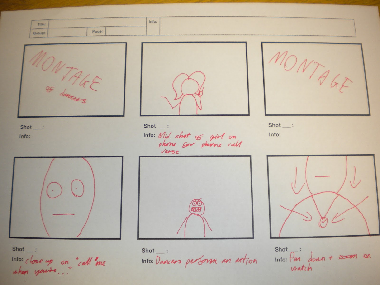


These are our shot lists and storyboards for the video. A lot of our shots are repeated and therefore the shot lists aren't as long, as the video seems.
Location Shots


These are some still photos to show the green room we will be using to film the entirety of our music video. We encountered a problem when we realised that the flooring in this room wasn't green but we overcame this by thinking we could place the boom box on a bright green chair that we can find in the college refectory :)
Wednesday 28 September 2011
Influential music videos
We had some influences when we were creating our music video, we did some background research before we constructed our idea, we looked into how successful some styles of music video have been with their certain styles, we worked on this and adapted our idea.
Our First Influence.
Rockstar - By Nickel Back.
http://www.youtube.com/watch?v=DmeUuoxyt_E&ob=av2n
After watching this song we decided we really liked the idea of having multiple people with different styles and stereotypes in our video (Image's 3 and 4) , we expanded on this after realising that a lip sync to our song would probably be quite unsuccessful due to the pace and style of our song. We decided to adapt this and do it with dancing instead, creating the same fun vibe that the rockstar video created.
We also liked the idea of the recurring character speaking the voice part of the song, (Image 1) we thought this idea would also work with using our artist in our video, (also contributing to Goodwin's theory of the need to sell the artist) Rockstar play on this by having celebrities in the video such as rock star Gene Simmons, who has been a influence to Nickelback. (Image 2)
This Video also uses the use of visuals and lyrics throughout the song the actors / actresses do hand gestures such as touching their hair, and having props such as car keys when cars are mentioned. We also want to include this in our video using a phone for the 'Call Me Up' Lines and the phone call.


Our Second Influence.
Madonna - Hung Up.
http://www.youtube.com/watch?v=EDwb9jOVRtU&ob=av2e
After watching this video we really liked the idea of the recurring boom box, (images 1 and 2) this idea helps to connect the song to a theme and suggest the idea of continuity, Also the way that the opening scene is the artist carrying on the boom box, we liked this idea also,
We also picked up on the way that this video uses the same style as Rockstar in the way that they use lots of different stereotypes and styles of people in their video, (Image 3) making the audience seem more vast and appealing to more than just one audience.
Also at the end of this video all the characters come together and do an ending dance, (Image 4) we really liked this idea too, we thought that we could incorporate this into ours and having a larger group of people dancing together at the end of the song as a kind of closure dance.


Our Third Influence.
Ed Sheeran - You Need Me, I Don't Need You.
This music video is a third example of one that uses the same visuals and lyrics we would like to achieve, such as backpack's, again this video uses the boom box prop, to bring the song back to the genre of the song. This video also uses the group dancing at the end of it, we again liked this idea as it is one single dancer for the majority of the song.


Subscribe to:
Posts (Atom)