Wednesday 30 November 2011

Media Evaluation - Jessica Howard

Question One 

We spent time researching into music videos such as Nickel Back - 'Rockstar' and Ed Sheeran 'You Need Me But I Don't Need You'. Both these videos expressed ideas that we hoped to include in our own video ideas. Such as lip syncing, dancing and visuals / lyrics. We also based the make-up of our main character on the film "clockwork orange" and the idea of using multiple numbers of characters in our video, after receiving feedback from Mark, we decided this idea pulled the focus away from the Artist, reducing the 'Need To Sell Artist' In Goodwin's Theory. 

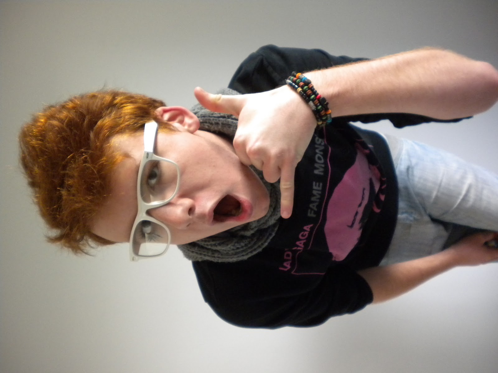
Our video uses the typical characteristics to the electric / pop genre of the song such as bright colours, lots of energy and dancing and we also gained influence through 'Lady Gaga's' unique fashion style. We also used visuals / lyrics in our media product such as the words "call me up" are met with the hand gesture in the shape of a phone. Our music video also uses quick fast changes in time with the music which relates to the visuals in the music. On regard to the "Need To Sell Artist" we used a lot of the 'artist' in the video, he is seen often lip syncing the words reflecting this approach. We expressed intertextuality through the use of fashion and props such as an MTV logo t-shirt, iPhone, designer footwear and also relating the target audience to the video. The voyeurism is concluded by the main majority of the shorts being done looking into the camera as if it was a mirror.

Question Two
All three of our pieces carry the same theme of vibrant colouring and the use of abstract props e.g. the rubber duck, and hand gestures.

The concept of our media package is full of energy, fun, it is made to be very modern, especially seen through the use of modern props i.e. iPhone and fashion. It could also be argued as unique, it expresses individual approaches auch as the make up and sunglasses as props. 

It's main goal was to give a positive image, i believe all three do this through the bright colours, facial expressions captured, e.g. The artists face in the video and on the digipak materials are positive and happy. This also creates a successful positive image of the artist. 

All of the materials attract the target audience through the target audience's age group featuring in the video. Also similar fashion ideas and hobbies, for example dancing, are seen in the video and on the digipak. The genre itself is commonly aimed at teenagers (electric-pop) which is an instant attraction of the target audience. The link between the 'geeky' styled glasses in the video and the front cover wording on the digipak, also including the track names all being made to relate to the options and their letter charts is a humorous theme that could be enjoyed by the target audience, overall i believe it will successfully attract the target audience. 

Question Three
The Feedback on our rough cut piece included comments such as the lip syncing being slightly out, positive feedback included that we achieved a successful music video that reflected the genre well. We also received feedback from the members of staff saying that we needed to include more editing techniques to make it more energetic and jumpy. We asked for advice on how to include this in our final cut.

Some peers also commented on the single coloured background saying that they liked it (this was before we added the green screen effects) we had to consider this before are final video as to whether it would work better with just the green background. 

Our final cut feedback included, the good concept on reflecting Goodwins theories successfully for example the genre characteristics of bright colours and fun props. They picked up on the way the main singer is seen singing into the camera at all times, they also said the use of the female character makes it fun and humorous.

Negative feedback was given on the transitions between shots, it was said that more could be used to make it more interesting.  

Question Four
We used final cut to edit our music video together, we enjoyed this because we are now familiar with the basics and could further our understanding with new techniques such as making the clip pulse and also make the character slide across the screen.

We used Photoshop to create our digipak this proved most difficult because we had limited knowledge of the programme. We couldn't complete the initial ideas we had and this became very time consuming and complicated.

We used blogger to keep track of everything we were doing and we also used it to refer back to recurring themes and ideas, this became very helpful. 

The HD video camera was really good to use, we were all able to look back on our footage instantly making discussion easy and we were able to view and change ideas if neccersary.

Again this was achieved on the still image camera, we could try numerous shots and view them instantly. 

Monday 28 November 2011

Digipak Final

Final Magazine Advert

Directors Commentary - Amy Douglas

A Director's Commentary is descriptive feedback from the director of a performance or a produced product. It's an opportunity to look back and suggest possible improvments that the producers could have made, and also say what's good about the product or performane; if any. Derector's Commentary is useful when producers are keen to hold future productions.

Here is an example of one way i think we could present our commentary:
http://www.bbc.co.uk/blogs/beinghuman/2009/07/directors_commentary_6_bernies.html

I like the way there is a voice over the clip, enabling the viewer to see and realised exactly what the director is talking about at the time.

Wednesday 23 November 2011

Magazine/Digipak examples

Here are some examples of what we are trying to follow when creating our digipak:
Chromeo

U2

MGMT

Digipak production

Although we had already taken pictures for our digipak, which consisted of Connor's lips in vibrant red lipstick, we thought we better take more pictures of Connor in front of the green screen. We done this to add variation to our digipak, and to sell the artist better. We also thought we should just for choice.

Once we got the pictures back, we decided on one particular picture as it stood out most to all of us. We first used the picture and wrote 'CHROMEO' above in one solid colour which happened to be orange as the colour orange played a big part in one of the props. However, after seeing this and being very pleased with it, we decided to try changing each letter of 'CHROMEO' different colours that also are included in the picture. We preferred this to the first idea.

Digipak Images


A clockwork orange theme

Throughout our production of the video, we have tried to keep this theme of 'A Clockwork Orange' in our project. We liked how the make up was laid out on the character in the film, so decided to do something similar with Conner's make up. This was emphasizing the make up on just one of his eyes.

We hope to use this style make up not only in the video,  but on the digipak as-well.
A Clockwork Orange

Open Evening Editing

We decided to stay and work during open evening as we thought the extra time would benefit us when trying to finish our video. We mainly focused on getting the background colours in, using chroma key. However, this seemed to take up more time than we expected so we had some help from other media teachers. Once we had filled in all of the background colours, we asked for other techniques to make our video feel alive and bubbly. This is where we learnt the thumping technique. Tanya explained how this thumping technique would work well with our video as it is fast paced and upbeat. This technique came in handy, and has been used in our final cut.

Although we didn't finish our video during this time, we told that we had one extra day to finish due to a misunderstanding. This meant we had all the little touch ups to do next lesson.

Monday 21 November 2011

Final Cut deadline lesson

Our final cut deadline day turned out to be stressful as we realised we had lots of little things to edit. after getting lots of feedback from the staff in the media department, we decided to scrap a few shots as they seemed 'unprofessional'. We also got told to make the shot of the feet more interesting by putting two or more images over the top of each other to create a more interesting and exciting shot. Our feet shot now includes feet coming from the top, side and bottom. This has made our video look a lot more interesting and keeps in with the feel of the video. 

Tanya also suggested that we added a 'thumping' motion on some of the shots to keep the fast paced feel to the song. We learnt how to make the shots feel like they are jumping out at you on Final Cut, and added this effect to parts of the video that felt like they were lacking in pace compared to the rest of the video. 

ideas for digipak


This is our first idea for our magazine cover. We are undecided whether to carry it on. 

Feedback of our rough cut

When we received feedback for our rough cut version, we were pretty happy with the results. Most of the feedback we received was positive with just a few things we could have improved on. The feedback told us that the clips we had and the variation of shots worked well with the pulse and timing of the song. The reviewers thought t had a good feel to it, and never really stopped working with the song.
Some things that we had to improve still were the colored backgrounds and we also had to make sure every clip was in time with the music.

Filming - Looking back

Our first day of filming went particularly well as we got most shots of Connor done. We just simply played the song while Connor improvised and lip synced. This meant we had a set clip we could use to fill in gaps during the video. 

Our second day of filming, we decided to add the lip shots of Connor lip syncing. We thought these images were effective and thought it would set a good image for a possible digipak cover. We also filmed a few shots of our dancer. Unfortunately we ran out of time, and had to get back to upload our footage we had shot that day. 

Our third day of filming consisted of us filming more of our dancer and we also got some footage of a few other people dancing. However, this footage did not look professional once we had uploaded the clips, and it did not make the final cut. 

Although we thought we had finished all the filming, when creating our video with the footage we had shot, we realised we needed more variety in the shots we had filmed. For example, we chose to film Connor lip syncing the same part wearing different glasses. These shots turned out to be a strong point in our video. 

Another thing we remembered we had to film was the female vocals. We decided to use Jess in this part. We went to the green screen as we did with all the other footage and to start off with filmed just one angle of her lip syncing the song. However, once we had uploaded the footage, we realised we had a big space gap to fill, so decided to shoot the same footage but from a different angle to add variation in our video. This is also a strong point in our video. 

Ideas for front cover images

When planning our Digipak, we had a number of images that we wanted to try out. one idea we thought of was an image of our artists lips, that are seen throughout the video. We thought keeping in touch with this image of the lips would help recognize the artist and link back to our video. With the image of the lips as our front cover picture, we would use vibrant colours and big fonts to carry on the 'in your face' technique that we used for the video.

Another idea was to use an image of our artist standing in front of the boom box that pops up in the video frequently. however, the image of our artist would stand out more, with the background image of the boom box slightly faded. The background colours would be light and vibrant linking back to the video. This is something that would differ from the first idea we had, using the lips, with the use of background colour.

Our final idea was influenced by The Smiths album cover, which includes four of the same image. We thought we could have a picture of our artist wearing different types of glasses in each of the four images. We would also change the colours of each image, to keep in touch with our video. The thought the use of different glasses used in the same four images would relate to our video as at one point, our artist is lip syncing while his glasses change.

Here is an example of The Smiths album cover:

The words to include on the back

We plan to add:

  • Chromeo - Call me up
  • The new, fresh sound
  • Comments, ratings and reviews from music magazines and journalists
  • Evaluation of music video
  • Description of artist

Must Have Things To Include On The Back Of Our Digipak

When designing our Digipak, we thought of information to include on the back of our product. Here's some of the things we will include.

Barcode
Rating and Reviews

Record Label Logo
Track Listing

Facebook and Twitter symbols with
the url's of both so the consumer
can go online and follow the artist.
Store logo showing where you can purchase other products produced by Chromeo.